前回は、Gridレイアウトについて紹介しました。

今回は、コントロールを水平方向、垂直方向に積んでいくように配置するStackPanelについて説明したいと思います。
StackPanelについて
レイアウトイメージ
レイアウトはその名の通り、積み上げていくイメージになります。
単純に操作するボタンを左から右に並べたい、買い物リストを上から下に並べたいなど、単純にコントロールを並べていきたいときに使用します。
もう少ししたら紹介しますが、ListBoxやListViewなどは、内部ではStackPanelを使用して繰り返し表示を行っています。

↑水平方向へ配置するイメージ
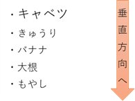
↑垂直方向へ配置するイメージ
コントロールの配置指定方法
StackPanelの指定方法は簡単です。単純にStackPanelの子コントロールとして配置すれば、積み上がります。あとは、StackPanelで水平方向、垂直方向のどちらの方向で積み上げるかを指定すれば配置完了です。
使い方サンプル
StackPanelのサンプルを紹介したいと思います。
Gridレイアウトのサンプルを作成したHello WorldプロジェクトにStackPanel用の画面を追加します。
メイン画面に以下のようにStackPanel用のボタンを追加します。
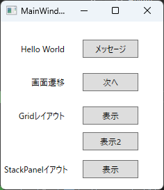
StackPanelサンプル用のウィンドウ「StackPanelLayoutWindow」を追加します。
StackPanelレイアウト表示ボタンのボタンクリックイベントに下記のコードを追加します。
        private void ButtonDisplayStackPanelSample_Click(object sender, RoutedEventArgs e)
        {
            StackPanelLayoutWindow window = new StackPanelLayoutWindow();
            window.Show();
        }
それでは新しく作成したウィンドウにStackPanelを使用したレイアウトを作成していきます。
水平/垂直方向配置
水平と垂直方向の配置をそれぞれ紹介しようと思いましたが、両方一度に記載します。
<Window x:Class="HelloWpfApp.StackPanelLayoutWindow"
        xmlns="http://schemas.microsoft.com/winfx/2006/xaml/presentation"
        xmlns:x="http://schemas.microsoft.com/winfx/2006/xaml"
        xmlns:d="http://schemas.microsoft.com/expression/blend/2008"
        xmlns:mc="http://schemas.openxmlformats.org/markup-compatibility/2006"
        xmlns:local="clr-namespace:HelloWpfApp"
        mc:Ignorable="d"
        Title="StackPanelLayoutWindow" Height="450" Width="800">
    <Grid>
        <Grid.RowDefinitions>
            <RowDefinition Height="40" />
            <RowDefinition Height="*" />
        </Grid.RowDefinitions>

        <StackPanel Grid.Row="0" Orientation="Horizontal">
            <Button Content="操作A" Width="100" Height="30" Margin="5,0"/>
            <Button Content="操作B" Width="100" Height="30" Margin="5,0"/>
            <Button Content="操作C" Width="100" Height="30" Margin="5,0"/>
            <Button Content="操作D" Width="100" Height="30" Margin="5,0"/>
            <Button Content="操作E" Width="100" Height="30" Margin="5,0"/>
        </StackPanel>

        <StackPanel Grid.Row="1" Orientation="Vertical">
            <TextBlock Text="キャベツ" FontSize="18" Margin="3"/>
            <TextBlock Text="レタス" FontSize="18" Margin="3"/>
            <TextBlock Text="きゅうり" FontSize="18" Margin="3"/>
            <TextBlock Text="大根" FontSize="18" Margin="3"/>
            <TextBlock Text="もやし" FontSize="18" Margin="3"/>
            <TextBlock Text="トマト" FontSize="18" Margin="3"/>
            <TextBlock Text="じゃがいも" FontSize="18" Margin="3"/>
        </StackPanel>
    </Grid>
</Window>
前回のGridレイアウトで行を二つ作成し、1行目に水平方向を、2行目に垂直方向のサンプルを記載しました。
水平方向は、ボタンを横に並べて、それぞれ操作するボタンを積み上げているイメージです。
垂直方向は、野菜リストを表示しているイメージです。
方向はOrientationプロパティで指定することができます。
実行します。
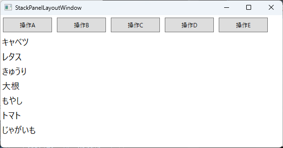
このようにStackPanelの中にコントロールを配置するだけで、このように積み上げることができます。
![[商品価格に関しましては、リンクが作成された時点と現時点で情報が変更されている場合がございます。]](https://hbb.afl.rakuten.co.jp/hgb/487db422.b9a0363a.487db423.e9a0aebe/?me_id=1198667&item_id=10001266&pc=https%3A%2F%2Fthumbnail.image.rakuten.co.jp%2F%400_mall%2Fsawaicoffee-tea%2Fcabinet%2Fraknewthum%2F250215%2Fykb_t_rak.jpg%3F_ex%3D240x240&s=240x240&t=picttext "[商品価格に関しましては、リンクが作成された時点と現時点で情報が変更されている場合がございます。]")


コメント